Wow, Sonic the Hedgehog for the Sega Genesis is a beautiful game.
Lately I’ve been enjoying watching no-commentary longplays of classic video games to really just sink myself into these works of art without having to worry about playing well myself, or listening to someone else’s thoughts on the game. It has been very fun.
On a recommendation from the resident Sonic expert in my life, Keira, I decided to watch through all of the sonic games in release order. I do have plenty of experience with Sonic, myself. Sonic and Knuckles was my first video game ever, but I had trouble clearing the first zone as a kid. I am by no means good at Sonic games. So watching these high level playthroughs all the way through the games was a real treat.
Using Color to tell a story
This is what stood out to me immediately. It’s simultaneously less detailed and more beautiful than I remember it being. The colors are very deliberately chosen to serve the game design and storytelling first and to look beautiful second. Something I feel we don’t see as often in games today.
Starting the game off in a level with so much blue and still being able to have your blue character stand out is a difficult thing to pull off. It really locks the idea of this game’s relationship with the color blue in addition to establishing the peaceful island vibes an opening stage should. It also shows us that this is Sonic’s home. His comfort zone. There is blue all around him. It’s just like him.
If we break down all of the most dominate colors in this frame, there are 11 shades of blue and only 5 of each green and brown. Sonic himself makes up 4 of those blue shades, but even without him, the blue still dominates this palette.
As Eggman enters the scene for the first time, he introduces the lifeless gray palette of his machine world. Here in Sonic’s home, it feels out of place and alien, symbolizing the start of Sonic’s journey into the unknown. Over the course of the game, we will see the balance of these colors completely shift as Sonic enters Eggman’s world.
My favorite detail though, is the fact that Sonic and Eggman share an identical color palette. If you take a look at the both of them, you can see that the reds of Eggman’s body and mustache are the same as Sonic’s shoes. The blues of Sonic’s body are the same as Eggman’s eyes. This helps to subtly tell us that these two characters are foils to each other. (yellow is represented by the rings, in Sonic’s case).
As we progress from stage to stage we start to see a gradual shift in the color palette. The purples and greens of Marble Zone still feel somewhat familiar to Sonic, but the darker shades indicate that we are reaching the end of Sonic’s known world. He hasn’t gone much farther from his home than this before. By the time we reach Act 2, the greens and blues are nearly gone being replaced by fiery reds and oranges.
By the time we reach my favorite area, Labyrinth Zone, Sonic is the only thing even remotely blue left on screen. The choice to make the water in this zone green rather than blue shows that the artists were really trying to reinforce how far from home Sonic really is at this point.
And finally, as we reach the end of the game we see the expansion of the gray metallic colors Eggman introduced us to in the beginning of the game. This time they are dominating the color palette instead of blue.
But the absolute cherry on top, the perfect final level, Scrap Brain Zone: Act 3. Wow, does this stage rule. Not only does it have my favorite color palette of the whole game, but narratively it shows the destruction that Eggman’s machines and factories have caused. Built right on top of the ruins of Labyrinth Zone, but with a palette swap showing that it has become even more alien than before. The green sludgy water now a toxic purple and the vibrant sandstone bricks have turned to an almost bone like gray. Complete drained of every last drop of life. This is what the future holds if Sonic does not defeat Eggman.
Speaking of that purple water, can we talk about the underwater palette swaps for Sonic? Watching that transition every time he goes into the water would put the biggest smile on my face. I love how dark the underwater palettes are as well. We only see them in the deepest areas of the two Labyrinth Zone maps and I think they both do a great job of selling the dark isolation that being underwater in some old ruins would have. Not to mention that drowning music…
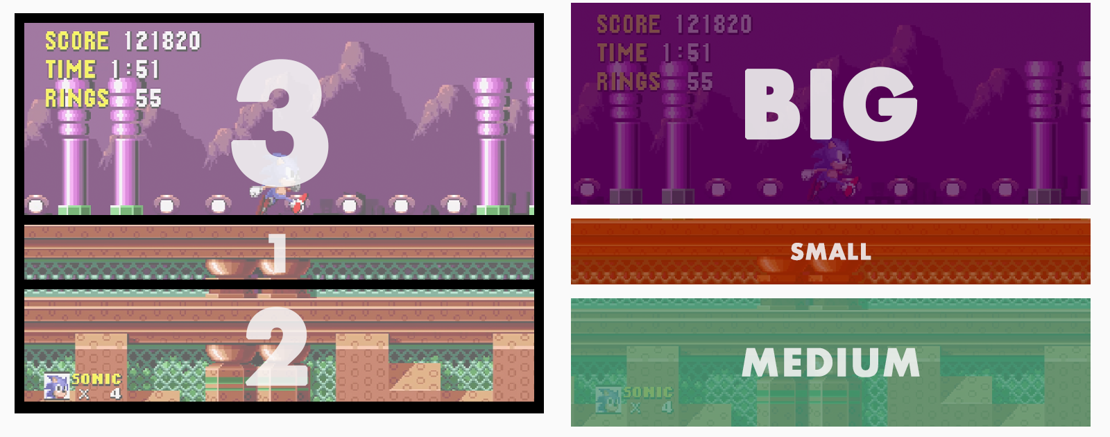
I also noticed another very cool composition trick the game uses to make pretty much any frame look beautiful. The levels are designed with a basic “Big, Medium, Small” composition in mind. Both literally, with the physical position of the platforms and background, but also in terms of the ratio of colors being used. Typically each Zone can be defined by 3 colors in a big, medium, and small capacity. The “big” zone takes up about half of the screen. While the “medium” zone takes up roughly 2/3 of the other half and the “small” zone occupies the remaining 1/3, set in between “big” and “medium”.
Because of these very specific and limited palettes, these stages become iconic and instantly recognizable. So much so that they can be evoked just by placing their 3 colors together in that same ratio of big > small > medium.
I could go on…
I could go on about the character design, the music, the animation, and everything else this perfect video game has to offer, but I’ll stop here. I have many more Sonic games to get through and I already know I’m going to be just as impressed with them.
At least for a while…
Thank you for reading this blog post! This is the first one I’ve written for this website and it’s a little rough around the edges. I’m always getting super excited about stuff like this and am dying to talk about it with someone! I think this blog will be a great place for me to get that out and just talk about cool art. I also will be sharing other things like behind the scenes of larger projects, digital sketch books, and whatever else feels appropriate.
OK BYE!


